Bold minimalism in UI/UX
Jul 8, 2025
Bold Minimalism in UI/UX: The 2025 Design Revolution
Bold minimalism is taking over UI/UX design in 2025, combining the clean look of minimalism with high-impact visuals to create interfaces that are both sleek and memorable. This trend responds to user frustration with cluttered designs, offering a refined approach that focuses on functionality, accessibility, and emotional connection. Searches for "bold minimalism UI" and "minimalist vs. bold design" have jumped by 180% this year, showing its growing influence.
Here's how bold minimalism is changing digital experiences—and how to use it effectively.
What is Bold Minimalism?
Bold minimalism removes unnecessary elements while making key parts stand out through:
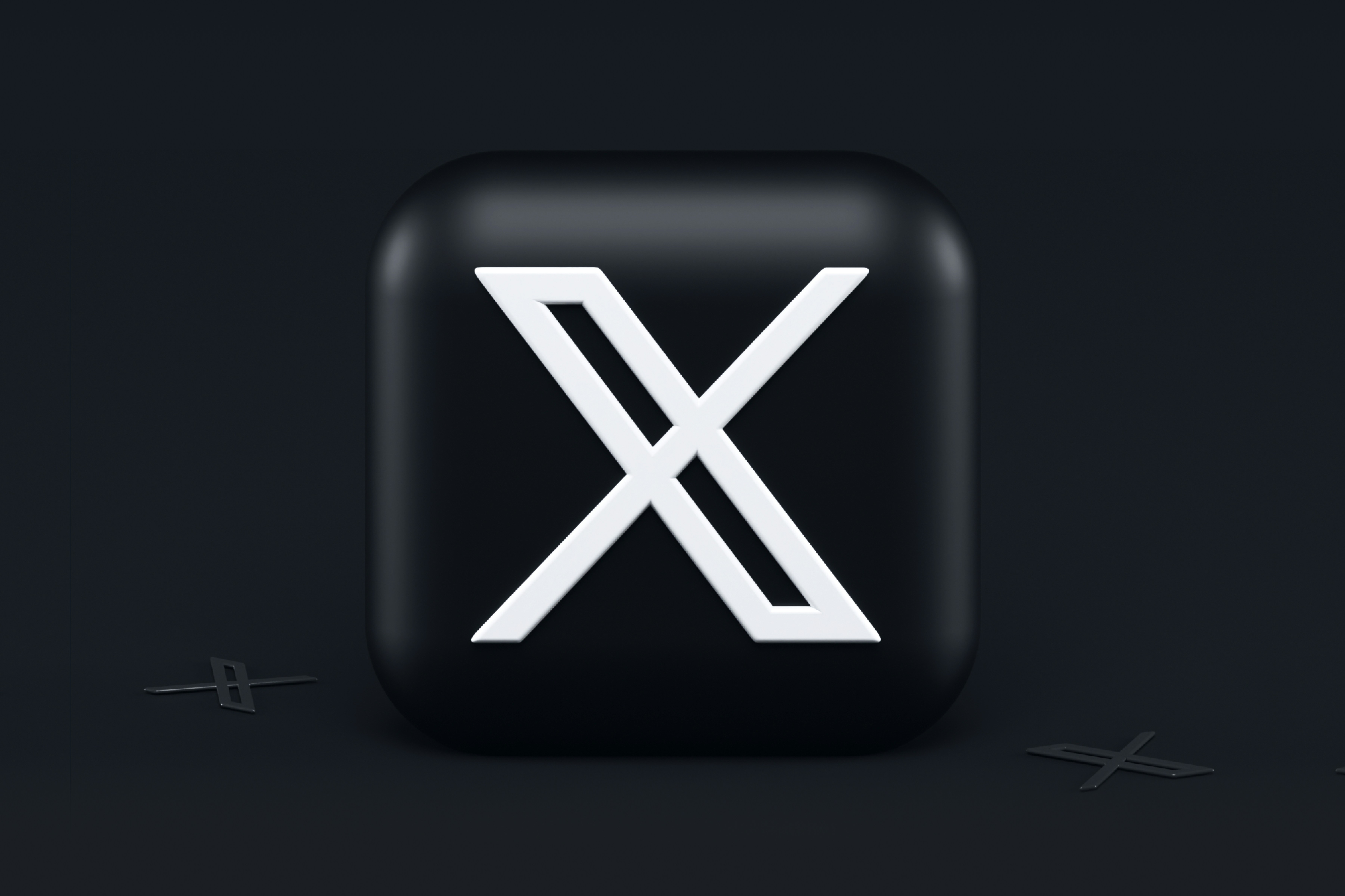
High-contrast color palettes: Bright colors (like neon accents on dark backgrounds) for immediate visual impact.
Oversized typography: Bold, clean fonts (like heavy sans-serifs) as focal points.
Strategic whitespace: Used to guide attention and reduce mental effort.
Limited elements: Only essential components remain, ensuring clarity and faster load times.
Unlike traditional minimalism, which can feel cold, bold minimalism adds personality without clutter.
Why Bold Minimalism is Trending in 2025
User Preference: 74% of users prefer clean interfaces, but 68% also want designs to "feel alive". Bold minimalism bridges this gap.
Performance Benefits: Simplified designs reduce load times by 30%, crucial for mobile users.
Brand Differentiation: Brands like Apple and Microsoft use bold minimalism to stand out in crowded markets.
Accessibility: High contrast and clear typography improve readability for diverse users.
Key Principles of Bold Minimalist Design
Color & Contrast
Use 1–3 bold colors (like electric blue against black) for hierarchy.
Dark mode compatibility improves energy efficiency and visual comfort.
Typography as a Centerpiece
Headlines dominate layouts, often with 200%+ scaling.
Pair bold fonts with plenty of spacing to avoid overwhelm.
Functional Whitespace
Whitespace should make up 30–40% of layouts to guide focus.
Example: Airbnb's landing pages use whitespace to highlight CTAs.
Purposeful Imagery
Single striking images or illustrations (like a lone product shot) replace galleries.
Micro-Interactions
Subtle animations (like button hover effects) add life without clutter.
Bold Minimalism vs. Competing Trends
Trend | Focus | Best For | Bold Minimalism's Edge |
|---|---|---|---|
Brutalism | Raw, chaotic layouts | Edgy brands/art sites | More polished and user-friendly |
Glassmorphism | Frosted-glass effects | AR/VR interfaces | Better readability and performance |
Flat Design | No 3D elements | Mobile apps | Adds emotional depth |
How to Implement Bold Minimalism
Start with a Grid
Use Bento-style grids to organize bold elements (like headlines + icons).
Test Contrast Ratios
Ensure text meets WCAG 2.1 AA standards (4.5:1 contrast).
Iterate with AI
Tools like Adobe Firefly suggest palette variations.
Prioritize Mobile
Bold minimalism reduces thumb strain with larger tap targets (48x48px).
Pitfalls to Avoid
Overdoing boldness: Too many colors/fonts bring back clutter.
Ignoring context: A fintech app needs more restraint than a creative portfolio.
Neglecting testing: 35% of users abandon sites with poor readability.
The Future of Bold Minimalism
By 2026, expect:
AI-driven adaptability: Interfaces automatically adjust boldness based on user preferences.
XR integration: Bold minimalist elements in AR/VR for spatial clarity.
Final Takeaway: Bold minimalism isn't just about looks—it's a strategic tool for engagement. As research shows, it boosts retention by 23% when done well.